Paper is not just a background for text and images. It is an active, physical part of the visual language. Whether you are holding a catalogue, a book, a planner, or a brochure, the first impression often forms even before you notice the content itself.
Grammage: the weight of impression
When choosing paper weight, the type of print product matters. Lower weights (80–130 g/m²) feel light and airy, making them suitable for multi-page brochures, inserts, or the inner pages of catalogues. Higher weights (150–200 g/m²) give the printed material greater stability, strength, and visual confidence—commonly used for covers, flyers, or representative print materials.
Paper weight also influences how colours behave during printing. On lighter papers, ink may show through more easily to the other side. Heavier weights provide greater density and a smoother surface, allowing colours to remain rich and sharply defined. They handle full-colour areas and finishing techniques better—without warping or curling.
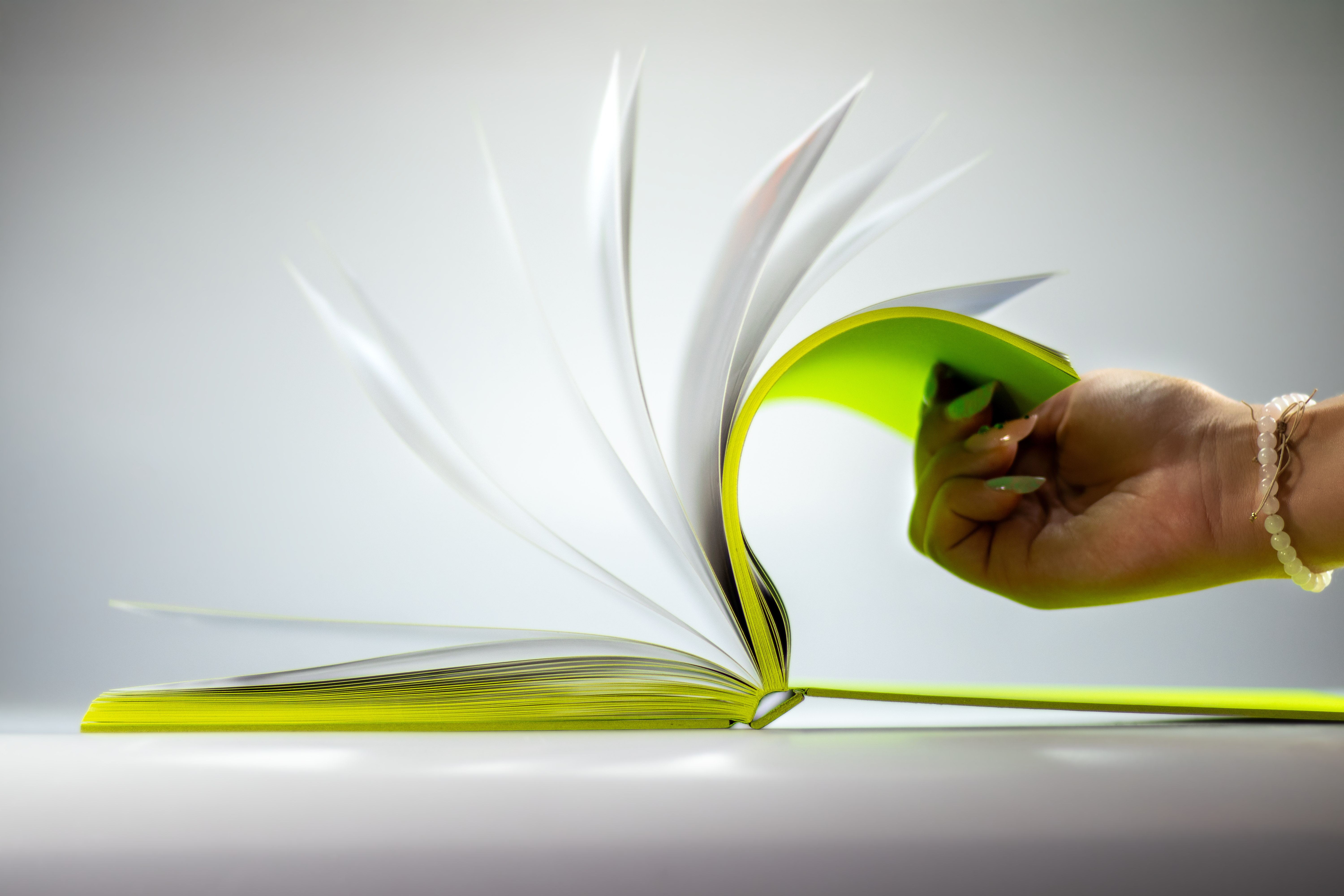
For mainly text-based publications, such as fiction, paper with lower weight and higher volume is often chosen. This makes the book lighter and more comfortable to read. Higher volume also gives the paper a sense of “bulk” – the pages feel airier, and the book appears thicker. In contrast, for printed materials meant to make a strong visual impression, heavier stocks are preferred, enhancing the character of the content from the very first touch.
Paper surface: a character you can see and feel
Surface finish fundamentally affects colour appearance, text readability, and the overall visual style of printed materials. Each type has its advantages and suits different purposes.
Glossy paper enhances colours and details while increasing contrast. It is most often used for high-end colour publications, photography books, and print projects where a strong visual impact is essential.
Matte paper offers a soft, understated look. By not reflecting light, it ensures higher readability, making it a popular choice for books, reports, or publications with large amounts of text.
Recycled papers are increasingly chosen by brands that want to combine high-quality printing with environmental responsibility. They have a slightly rougher texture to the touch, and their colour ranges in warmer tones—from off-white and cream to shades with grey or beige undertones, depending on the raw materials used. Such paper feels authentic, non-uniform, and natural. Eco-friendly papers often contain additives from natural materials—like coffee grounds, beet fibres, or corn components—giving them a unique appearance and distinct visual texture. This can add a personal character to the printed material and enhance both its content and context.
Whiteness and coloration: when the tone of the paper influences the tone of the message
The colour tone of paper influences both the overall impression of a book and the way readers perceive its content.
Papers with high whiteness provide maximum contrast, sharpness, and colour clarity. They are typically used in photographic and art publications, modern graphic design, or advertising prints, where strong visual impact is essential.
In contrast, toned papers soften sharp transitions and create a gentler effect. They are often chosen for books where the author wants to evoke a calm and pleasant reading experience without distracting reflections.
Printed colours always interact with the surface they are applied to. The same print data will look different on pure white paper than on cream or naturally toned stock.
The colouring of paper therefore significantly shapes the final atmosphere of the publication as well as the readability of fine details.
Tip for the end
The choice of paper is therefore always a combination of aesthetics, functionality, and the tactile feel of the finished print. If you are looking for inspiration among high-quality papers, you might explore the Galerie Art range from Sappi, which is a popular choice for a wide variety of print projects.
